Quantcast
Channel: _Black_Acrylic
Viewing all 321 articles
Browse latest View live

Members Show @ Generator Projects 31.01.14 - pictures

$
0
0
To the Generator this evening for their annual Members Show. I took a few photos and here they are:

The name of the show is Members Show


Becca Clark - Generator committee portraits

The Dundee art massive


Cully McCulloch - Lazy mind, lazy (he)art


Ben Robinson - HRH Kate, Inverted


Lily Morris - Untitled

http://generatorprojects.co.uk/generator-members-show-2014/

homage

$
0
0


Lucio Fontana - Concetto spaziale, La fine di Dio, 1963

Extract from

Dawn was already breaking, and a light green mist was forming on the skin of the mourners' faces, on the plaster of the walls, and on the gray blanket of the sky, in which gaps had been torn here and there by the bitter wind of early morning; and through the rents a pinkness was visible, like the new flesh that forms over a wound. The crowd continued to wait in the courtyard, praying aloud, and every so often interrupting its prayers to give expression to its grief.

   At about ten in the morning pandemonium broke loose. Weary of the long wait, impatient to have news of their dear ones, to know if they were really dead or if there was any hope of saving them, and fearful of being betrayed by the doctors and orderlies, the crowd began yelling, cursing and hurling stones against the windowpanes; and finally, by sheer weight of numbers, they broke open the doors. As soon as the heavy portals yielded the deafening, ferocious clamor died down as if by magic; and silently, like a pack of wolves, panting, gritting their teeth, every so often peering through doorways, running with lowered heads through the passages of the ancient building, made fetid and filthy by time and neglect, the crowd invaded the hospital.

     But having reached the entrance to a cloister, from which dark corridors radiated in every direction, they burst into a terrible cry, and halted, petrified with horror. On the floors, piled up on heaps of garbage, bloodstained garments and damp straw, lay hundreds and hundreds of disfigured corpses, their heads enormous, swollen through suffocation and blue, green and purple in color, their faces crushed, their limbs truncated or torn right off by the violence of the explosions. In a corner of the cloister stood a pyramid of heads with wide-open eyes and gaping mouths. With loud cries, frantic wails and savage laments the crowd threw themselves on the dead, calling them by name in voices that were terrible to hear, fighting for possession of those headless trunks, those torn limbs, those severed heads, those miserable remains which deluded pity and love seemed to recognize.

   Surely no human eye ever witnessed a struggle so fierce, nor yet so pitiful. Every scrap of flesh and bone was fought for by ten or twenty of those demented creatures, who were maddened by grief and even more by the fear of seeing their own dead carried off by others, of seeing them stolen by their rivals. And that which the raid had failed to do was finally accomplished by their macabre fury, their mad pity; for every corpse, torn, truncated, rent asunder, ripped to pieces by a hundred eager hands, became the prey of ten or twenty demented creatures, who ran off, pursued by hoards of yelling people, hugging to their breasts the miserable remains which they had succeeded in rescuing from the fierce pity of their fellows. The wild affray spread from the cloisters and corridors of the Ospedale dei Pellegrini into the streets and alleys, and finally spent its fury in the cellars of the city's slums, where the people could at last find an outlet for their pity and love in tears and in the payment of their final homage to the mangled corpses of their dear ones.

Translated from the Italian by David Moore

https://www.goodreads.com/book/show/15799199-the-skin

Kate Bush - TV

$
0
0
Catherine "Kate" Bush, CBE (born 30 July 1958) is an English singer-songwriter, musician and record producer. Her eclectic musical style and idiosyncratic vocal style have made her one of the United Kingdom's most successful solo female performers of the past 35 years.

During the same period as her 1979 Tour of Life, she made numerous television appearances around the world, including Top of the Pops in the United Kingdom, Bios Bahnhof in Germany, and Saturday Night Live in the United States (with Paul Shaffer on piano). On 28 December 1979, BBC TV aired the Kate Bush Christmas Special. It was recorded in October 1979 at the BBC Studios in Birmingham, England; choreography by Anthony Van Laast. As well as playing songs from her first two albums, she played "December Will Be Magic Again", and "Violin" from her forthcoming album, Never for Ever. Peter Gabriel made a guest appearance to play "Here Comes the Flood", and a duet of Roy Harper's "Another Day" with Bush.
http://en.wikipedia.org/wiki/Kate_Bush

In 1978 Kate made her debut on Dutch television in a program that has gotten to be known as “De Efteling Special”, which was broadcasted on 11 May 1978 at 19.20 hours on Channel 1 (Ned 1). The amusement park De Efteling served as a backdrop for six songs of The Kick Inside: Moving, Wuthering Heights, Them Heavy People, Strange Phenomena, The Man With The Child In His Eyes and The Kick Inside.

Early 1978 the Haunted Castle is completed and the opening is scheduled on 10 May that year. De Efteling never built such a costly attraction before (it costed 1.6 million Euros at the time) and wanted to promote it as much as possible. The designer appeared in a popular talk show and in April a documentary featuring the Haunted Castle was made by filmmaker Rien van Wijk, who was eager to shoot in the latest attraction before it officially opened. Kate, who just had a big hit in the Netherlands with Wuthering Heights, made her debut on Dutch television in this special. Her popularity was used to draw the attention to the Haunted Castle (and the popularity of De Efteling could draw the attention to Kate).
Birgitte
http://www.angelfire.com/stars4/katebush/EftelingSpecial.html


I found it difficult not to share this freshly uploaded winter treat - the whole of Kate Bush’s Christmas Television Special from 1979. Filmed in October of that year, the show stars the beautiful songstress, together with her band and Peter Gabriel. While we have shown one song from this before, we have never managed to find the whole program online until now - and it’s been worth the wait. Enjoy.
Paul Gallagher
http://dangerousminds.net/comments/kate_bush_tv_show_christmas_1979

I was recently asked about this BBC TV special and I thought I'd share my comments here.  Kate: Kate Bush Christmas Special is a stage performance by Kate Bush with her special guest Peter Gabriel.  Though most of the songs are not holiday ones, they come from Bush’s first three albums (Never for Ever her third album would be released in 1980 after this 1979 TV special was taped).  The performances include costumes, choreographed dances and a wind machine, creating an eclectic music TV special to say the least.

This is one of the programs that makes my research quite difficult--because it calls itself a Christmas Special yet it contains only one performance of a Christmas song "December Will Be Magic Again"  (a song that wouldn't be released as a single by Bush until the following year, in 1980).  TV programming that calls itself a Christmas Special and yet contains little to no Christmas entertainment is actually quite common--especially on the BBC.

Between the end of November and the end of December each year, there is quite a bit of special programming on television.  Remember Elvis' 1968 Comeback Special--it aired in December that year and includes only one holiday song, a performance of "Blue Christmas."  Is it considered a Christmas special?  No, not really.  And so, despite its title, the lack of holiday programming in Kate Bush's 1979 TV special means it shouldn't be considered a Christmas special either.  But the Kate Bush Christmas Special is certainly worth watching!  Check it out:
Joanna
http://www.christmastvhistory.com/2012/04/kate-bush-christmas-special-1979.html


  • Concept Video - Kate Bush used to love making weird mini-movies for her songs in the 80s. Notable examples include:
    • "Experiment IV", a horror movie pastiche in which a bunch of government scientists in a spooky military facility, including Dawn French and a pre-House Hugh Laurie, create an unstoppable sonic weapon. As you expected it might, the weapon, played by Kate Bush in a ghost outfit, rampages around and kills everyone horribly. Hoorah!
    • "Cloudbusting" - this one is based on the life of Wilhelm Reich. The reclusive scientist pursued by naughty government types is played by Donald Sutherland, Kate Bush plays his eight-year old son (in a hilariously unconvincing child costume) and the design of the very cool rain machine (Cloudbuster) was inspired by H.R. Giger.
    • "Hounds of Love" - a pastiche Hitchcock thriller.
    • The Line, The Cross, And The Curve, a 1993 short film based on her album The Red Shoes, starring herself, Miranda Richardson, and Lindsay Kemp.
    • "Running Up That Hill": Largely an elaborate dance piece done as a Take That at those critics who slammed the "Wuthering Heights" video.
    • "This Woman's Work": A renarration of the Movie "She's Having a Baby"
    • "Misty": an animation about a woman who sleeps with a snowman and wakes up to find that he's melted.
http://tvtropes.org/pmwiki/pmwiki.php/Music/KateBush


Kate Bush has sent out a message of support to an axed contestant on The Voice UK.

Liam Tamne lost out to John Pritchard in the Battle Round on Saturday's (May 25) show, after they sang a version of Phil Collins and Philip Bailey's 'Easy Lover'.

will.i.am had previously picked Tamne for his team after he sang Kate Bush's song 'This Woman's Work'.

On her website, Bush wrote that she was "sad" about Tamne's exit and wished him luck for the future.

"I was sad to see that Liam didn't get through on The Voice this week. It must be so tough for all the performers who don't stay in the show," she said.

"Liam, you mustn't be disheartened. You really have a special talent and you're a fantastic singer. You've already been heard and appreciated by a huge audience.
"Try not to be too disappointed. Just keep going. I'm sure that your nan would be very proud of you having achieved so much.

"Good luck with all your future projects. Very best wishes, Kate."

Jessie J and Danny O'Donoghue were visibly shocked when will.i.am elected to choose Pritchard over Tamne on Saturday's show.
Tom Eames
http://www.digitalspy.co.uk/tv/s154/the-voice-uk/news/a485290/kate-bush-sends-support-to-axed-the-voice-uk-singer-liam-tamne.html


I still find out that many fans don't know about this video. So I uploaded it myself.

Köln Frechen Benzelrather Eisenbahn KATE BUSH'S FIRST TV (Kite & Wuthering Heights LIVE) Germany February 9th 1978

Try to pronounce the name if you are not German! :)
Sharmilka


Breakin'

$
0
0
Breakin', released as Breakdance: The Movie in some countries, is a 1984 breakdancing-themed film directed by Joel Silberg. The film setting was inspired by a German documentary entitled Breakin' and Enterin' set in the Los Angeles multi-racial hip hop club Radiotron, based out of Macarthur Park in Los Angeles. Many of the artists and dancers, including Ice-T (who makes his movie debut as a club MC) and Boogaloo Shrimp, went straight from Breakin' and Enterin' to star in Breakin'. Ice-T has stated he considers the film and his own performance in it to be "wack".
http://en.wikipedia.org/wiki/Breakin%27

I just viewed an old tape of "Breakin'" last night. It's been 17 years since I first viewed it at the movies. However, I can't believe the powerful effect it still has on me. Yes, admittedly, the plot is not original, the screenplay is truly by-the-numbers, and the acting is generally amateurish. Yet, in spite of these shortcomings, the movie is still catchy, sincere, and engrossing. That's because of the talented stars who really love what they do, namely, breakdancing and "poppin' and lockin'," along with the stimulating, get-on-your-feet dance music.

This movie is like a time capsule of the 80s, with hints of the future. Moreover, I still find it to be inspirational, motivational, and hypnotic. Looking at these streetdancers and the jazz dancer go after their dreams with sheer determination, talent, and grit makes me want to jump up and do the same thing! Yes, I'm nearly fifty, but looking at this movie gave me another shot of adrenalin to do what I need to do in my daily life. "Ain't no stoppin' us" is the endless musical mantra in "Breakin'"...nothing stopped the dancers, and nothing's going to stop me, either. Watch "Breakin'" for yourself, and you'll see what I mean. 9/10 Rating.
zach-27
http://www.imdb.com/title/tt0086998/reviews?ref_=tt_urv

now lovingly restored on DVD and it's a treat; amazing original breakdancing scenes from Los Angeles, riotously colourful wardrobes, an incredibly high quality 80s electro/freestyle soundtrack, and all played out with such beautiful innocence and sincerity
William Bennett
http://williambennett.blogspot.co.uk/2012/04/fillmore-discos-69.html

There are going to be several street dancing movies this summer and “Breakin’” is the first one, sweet and high-spirited and with three dancers who are so good they deserve a better screenplay. This is really two movies: A stiff and awkward story, interrupted by dance sequences of astonishing grace and power.

The story, alas, is predictable from beginning to end. We meet Kelly, a young Los Angeles dancer (Lucinda Dickey) who is the student of a hateful choreographer. Through a friend she meets a couple of break-dancers on the boardwalk at Venice. They have a concept of dancing that’s totally different from hers; while she polishes technique, they turn up the volume on their ghetto blasters and lose themselves in the joy of street dancing. She likes them, dances with them, and they form a team.

The fact is, there’s a movie here somewhere. Dickey has a wonderfully fresh presence and a level-headed likeability, and she can dance (we will, I think, hear a lot more from her). Chambers and Quinones are two of the more original movie characters in a long time. I’ll bet an interesting documentary could have been made about how these three performers met, how they learned to work together, how the street dancers taught their moves to the traditionally trained Dickey, and how they got along offscreen. Those subjects supply the fictional plot of this movie – but the script is too amateurish and the direction too clumsy to take advantage of the great material.

You like street dancing? This is a great movie, if you can manage to ignore about two-thirds of it.
Roger Ebert
http://www.rogerebert.com/reviews/breakin-1984 

In the movie Breakin‘, when Turbo’s moon walk sweeps the sidewalk to Kraftwerk’s “Tour de France”, cinematic history was made. That scene will be noted in the annals of time as the greatest two minutes in cinema ever, forever, until the end of time.

Greatest two minutes of cinematic history, AKA Turbo broom scene:


Breakin‘ has everything a good movie should have; leather gloves, moon walking, nice butts in tights, electro music, a guy with no legs doing the windmill and Ice mutha fuckin T. Breakin’ literally broke the mold when they came up with that insanely awesome movie formula.

This is real break dancing -not this bullshit “so you think you can dance” kinda break dancing that we see so much of in today’s society. This is breakin’ back when it was more punk rock than punk rock, with ripped T-shirts, leather, studs, spray paint and took place in the streets. To sum it up I will quote the illustrious Bar-Kays it was a “Freak show, baby, baby on the dance floor… They’re wearin’ miniskirts and camisoles, tight leather pants or nothing at all… Guys with guys, chicks with chicks, it really doesn’t matter they just do it for the kicks”. Those are words to live by my friends.

Which brings me to my last point of proof that this is one of, if not thee best movie of all time. The sound track is insanely good. I had this 12′ growing up and it largely inspired my entire music making process. The music in the movie is proper Electro, back when that term was used to describe artist who made people dance to their unique brand of electronic funk, not this new bastardization of that term by EDM dicks with mouse masks; seriously, fuck those guys.

The soundtrack features amazing bands like the Bar-Kays, Kraftwerk, The Art of Noise and Hot Streak. The jewel of the sound-track and the movie is Ice-T and the Glove’s amazing 808 and 303 acid bass line, hip-hop monster “Reckless”.
SINS
http://mishkanyc.com/bloglin/2013/05/21/pop-it-to-lock-it-break-it-to-make-it-breakin-1984/ 

ZINE IDOL @ HMC Micro Cinema, Dundee 08.02.14

$
0
0
5 ZINE MAKING TEAMS, 5 PRESENTATIONS, 500 HUNDRED POUNDS!

You may have heard that Yuck 'n Yum said farewell at the end of 2013. However, to celebrate new beginnings we are offering our support, guidance, and £500 to one lucky zine making team.
Our team of judges have picked through the proposals to form a short list of 5 zine making teams:

Anti-Zine, Barnum’s Baby, CC, Plastik Zine and ST-ART Magazine.

All will be presenting their zine propsals this Saturday and one will win the seed money of £500. This is ZINE IDOL!

We would love you to be part of the audience and meet and mingle with the zine makers.

14:00 @ MICRO CINEMA- HANNAH MACLURE CENTRE, DUNDEE 08.02.14


http://zineidol.yucknyum.com/

Zazous

$
0
0


The Zazous were a subculture in France during World War II. They were young people expressing their individuality by wearing big or garish clothing (similar to the zoot suit fashion in America a few years before) and dancing wildly to swing jazz and bebop. Men wore large striped lumber jackets, while women wore short skirts, striped stockings and heavy shoes, and often carried umbrellas.
http://en.wikipedia.org/wiki/Zazou


During Nazi occupation of Paris there was a foppish revolt by a group of French youths, (between 13-21 years old, described by the occupiers as J3 age group for rationing and identity card purposes) in a mannered sarcasm first rehearsed by Baudelaire. They were first described as “L’Homme Revolte” by Albert Camus but by 1941 they had named themselves The Zazous, inspired by the Cab Calloways’s Jazz hit from 1933 “Zah Zuh Zah”, which was a part of an overbearing American influence by way of Jazz and Swing that infiltrated French youth culture and ultimately became a substance for which they opposed Nazi rule and particularly Nazi censorship.
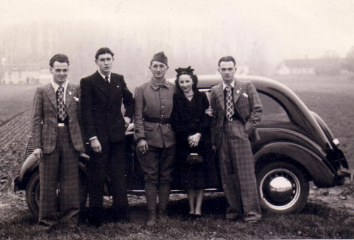
The boys wore a dandy uniform with long check coats, high collared shirts and slim trousers with bright socks and had hair “oiled like a salad”, and the girls adorned themselves in suede coats, roll neck sweaters, with their hair tightly rolled to a bun at the front of their heads and made themselves up with scarlet lips and nails. Their culture existed under ground with surprise parties that were highly illegal gatherings where they behaved like obnoxious adolescents and ended the nights by smashing everything up.

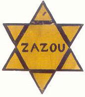
They perfected the negative aesthetic and took energy from their enemies, through clever mockery and a sarcastic attitude that symbolized their resistance. This was typified by many of the Zazou wearing a Yellow Star exactly like the one that singled out the Jew except for the detail of the word “Swing” in the middle.
Budding Grove
http://www.examiner.com/article/les-zazous-fashion-nazi-occupied-france 
'Dancing, particularly upon Sundays, had been the rage among young people before the war, but after the Occupa­tion was banned both by Vichy and the Germans. The Germans were wary because such gatherings of young people might cause unrest. Vichy had other reasons: dancing was held to be indecorous when so many Frenchmen had been killed or were languishing in prisoner-of-war camps; it would encourage fraternization with German soldiers; it might promote promiscuity…Nevertheless, in early 1942 the prohibition began to be flouted. Cardinal Gerlier noted with regret that even some Christian families were infringing the ban, which he deplored because 'among all the different forms of recreation, dancing is the one that expresses joy most fully'. There was too much misery abroad and, he added in a reference to the Germans, it was wrong 'to dance under the gaze of those who observe us'.

Those ever-present 'observers' had lifted the ban in the occupied zone for their own troops by mid-1941 but had left the decision regarding French civilians to the Vichy authorities for 'if [they], in spite of the disgraceful defeat of their country, wish to dance, it is in the German interest not to prevent their so doing'. Since Vichy continued the prohibition, many private dancing schools, which were allowed, sprang up to circumvent the ban. Learning ballet and ballroom dancing was suddenly found to be a very popular activity. Measures were therefore taken to control the schools by imposing stringent conditions: not more than fifteen couples per session were allowed to take part; enrol­ments had to be for at least five sessions; apart from the dancers, only parents could be present; the sole musical accompaniment must be a piano or a gramophone; no drinks whatsoever could be served; advertising of classes was for­bidden.

The high fees demanded by the schools limited their clientele and frequently they were patronized by middle-class 'zazous', the contemporary equivalent of the 'teddy-boys' and their partners. Descriptions of this gilded youth vary. Simone de Beauvoir terms them rebels against the Revolution Nationale, wearing long hair 'a la mode d'Oxford', sporting umbrellas… and generally comporting themselves in an anarchic, Anglophile fashion… They affected an outlandish garb: the young men wore dirty drape suits with 'drainpipe' trousers under their sheep­skin-lined jackets and brilliantined liberally their long hair, the girls favoured roll-collar sweaters with short skirts and wooden platform shoes, sported dark glasses with big lenses, put on heavy make-up, and went bareheaded to show off their dyed hair, set off by a lock of a different hue. The 'zazous' used English expressions, read American literature, and delighted in crooning, in the style of Johnny Hess, 'Je suis swing, dadoudadou/ Dadou la. . .oua. . .oua.'
Source: The Youth of Vichy France – W.D. Halls (Clarendon Press, Oxford, 1981)
http://history-is-made-at-night.blogspot.co.uk/2007/01/zazous-dancing-under-nazis-in-france.html

In 1940, the Nazis had occupied France. The Vichy regime, in collaboration with the Nazis and fascist itself in policies and outlook, had an ultra-conservative morality and started to use a whole range of laws against a youth that was restless and disenchanted. In Paris, young people started meeting in cafes, passing their time mocking the politics of the time. This spontaneous development was a sharp response to the deadening effect on society of the Nazi-Vichy rule. They met in cinemas, in the cellar clubs and at parties arranged at short notice.

These young people, who called themselves Zazous, were to be found throughout France, but were most concentrated in Paris. The two most important meeting places of the Zazous were the terrace of the Pam Pam cafe on the Champs Elysees and the Boul’Mich (the Boulevard Saint-Michel near the Sorbonne).

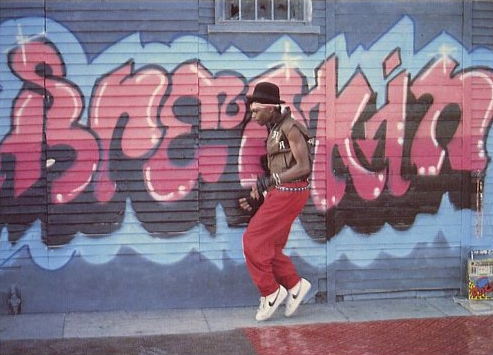
The male Zazous wore extra large jackets, which hung down to their knees and which were fitted out with many pockets and often several half-belts. The amount of material used was a direct comment on Government decrees on the rationing of clothing material. Their trousers were narrow, gathered at the waist, and so were their ties, which were cotton or heavy wool. The shirt collars were high and kept in place by a horizontal pin. They liked thick-soled suede shoes, with white or brightly-coloured socks. Their hairstyles were greased and long.

One fascist magazine commented on the male Zazou: “Here is the specimen of Ultra Swing 1941: hair hanging down to the neck, teased up into an untidy quiff, little moustache a la Clark Gable... shoes with too-thick soles, syncopated walk.”

Female Zazous wore their hair in curls falling down to their shoulders, or in braids. Blonde was the favourite colour, and they wore bright red lipstick, as well as sunglasses, also favoured by some male Zazous. They wore jackets with extremely wide shoulders and short, pleated skirts. Their stockings were striped or sometimes net, and they wore shoes with thick wooden soles.

Though they did not suffer like their contemporaries in Germany, the working class Edelweiss Pirates, some of whom were hanged by the Nazis, nevertheless, in a society of widespread complicity and acquiescence, their stand was courageous and trail-blazing.
Taken from Organise! 59, the theoretical journal of the Anarchist Federation
https://libcom.org/history/1940-1945-the-zazous  


Imagine, amid the grey serge of wartime France, a tribe of youngsters with all the colourful decadence of punks or teddy boys. Wearing zoot suits cut off at the knee (the better to show off their brightly coloured socks), with hair sculpted into grand quiffs, and shoes with triple-height soles - looking like glam-rock footwear 30 years early - these were the kids who would lay the foundations of nightclubbing. Ladies and gentlemen, les Zazous.

The Zazou look was completed with high collars, impossibly tight ties and long sheepskin-lined jackets, with a curved-handled umbrella carried at all times (copied from British prime minister Neville Chamberlain, regarded as quite a style icon). Female Zazous wore short skirts, shabby furs, wooden platform shoes and dark glasses with big lenses, and chose to go hatless, to better show off the single lock of hair they had bleached or dyed. They took their name from the Cab Calloway-style scatting in a song Je Suis Swing, by their hero, French jazz singer Johnny Hess.

Like peacock versions of Hamburg's swing kids, the Zazous thrived in opposition to the Nazis' hatred of jazz. When Goebbels issued edicts banning the "rhythms of belly-dancing negroes", the remnants of Montmartre's jazz community were deported, interned, or at very least unemployed. The scene that had raised Josephine Baker to legend resorted to home-grown musicians playing US jazz standards, renamed on programmes to fool the censors.

While the adults skirted the Nazi regulations, their younger counterparts favoured far more public defiance. Raising a finger to the world, the Zazous would shout "Swing", give a little hop, then cry out, "Zazou hey, hey, hey, za Zazou!," followed by three slaps on the hip, two shrugs of the shoulder and a turn of the head. Not surprisingly, Zazous were regular targets for the boot-boys of the collaborationist Vichy government, suffering organised beatings, having their heads shaved and being cast out to sweat in the fields.

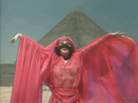
As the pogroms began, some Zazous went even further and took to wearing yellow stars of David to show solidarity with the Jews. To underline their outlaw musical taste, they wrote "swing" across them. Several found themselves in internment camps as a result. Even stranger, when liberation was imminent, female Zazous blacked up their faces to show their love for jazz and America.

Crucially, it was the Zazous who gave Paris its enduring taste for dancing in cellars to records.

Unable to congregate openly, they took their precious swing 78s underground, for les bals clandestins in cafés off the Champs-Élysées or in the Latin Quarter. There, they would throw English slang at each other, swap American novels and jitterbug to all hours.


ZINE IDOL @ HMC Micro Cinema, Dundee 08.02.14 - pictures

$
0
0
To Dundee's Hannah Maclure Centre today for Zine Idol, Yuck 'n Yum's contest to find a self-published zine to win support, guidance, and £500 seed money to make their zine dreams a reality. I took a few photos and here they are:


The name of the event is Zine Idol

MC Alexandra holds forth

The judging panel (L-R your correspondent, Andrew, Claire)

CC

http://thecollagecollective.tumblr.com/

Barnum's Baby

http://wevebecomemango.blogspot.co.uk/

Plastik zine

https://www.facebook.com/plastikzine

St.art Magazine

http://www.st-artmagazine.com/

Anti-Zine

http://www.antizine.com/

Big decision: CC are the Zine Idol winners!!!!! Congratulations CC!

http://zineidol.yucknyum.com/

Joanne Tatham & Tom O’Sullivan - HK

$
0
0
Joanne Tatham and Tom O’Sullivan work in collaboration to produce provocative and interrogative works that are often concerned with the mythic potential of art.

Utilising sculpture, painting, architecture, performance, literature, institutional critique and curation, the artists re-stage and re-present a vocabulary of images, phrases and forms that are part of a common history to create carefully crafted paths, displacements and diversions.  These act as a tool for exploring the world of art - with its own collective mythology of forms, objects and histories.
http://www.chapter.org/joanne-tatham-and-tom-osullivan-tool-making-signs-1


The Glasgow artist duo Joanne Tatham (born 1971 in West Yorkshire) and Tom O’Sullivan (born 1967 in Norwich), who have worked together since 1995, attracted attention last year in the Tramway exhibition space in Glasgow with their installation "HK“. Six-meter-high black letters formed the three-dimensional slogan "Heroin Kills“, undermined by its monumental nature. Tatham & O’Sullivan, whose works are in the tradition of concept art, are concerned with the questioning of the parameters of art, the investigation of what contemporary art can be and what it can accomplish. The installation "HK“ therefore operated in the realm between purely artistic statement and social reality (given that Glasgow is the British city with the highest rate of heroin addicts). Tatham & O’Sullivan draw their image and form vocabulary from a rich store of existing languages, extending from art history over applied arts, esotericism, and pop music to theater, while their interest is primarily in hyper-encoded and iconic forms. Their installations are however more than merely a sampling of various quotes; they are a clever play on the multireferential nature of the characters employed, not least of all satirically referring to the clichés of installation art. 
http://www.kunsthausglarus.ch/en/frontend/exhibition_detail/318

Heroin kills. Smoking kills. Alcohol kills. These things we know, even as we reach for a dram, a puff or a fix. The odd status of such warnings, these axioms of addiction, is what Joanne Tatham and Tom O'Sullivan explore in an astonishing, epic sculptural installation. Three-dimensional letters, 6m high, stretching right across the vast main space at Tramway, spell out their message (heroin kills) in monumental form, one that is both shocking and playful.

What play there is comes from the references to other famous groups of letters - those that spell out Monty Python and Hollywood, the black letters saying "The Ramones", held by the group in a photograph. It's also about the scale of the piece, and its dour monochrome of white walls and coal-black letters, echoing the atmosphere of those 1980s Don't Die of Ignorance health warnings about HIV that featured tombstones and were lit like a morgue.

But HK is more than smart intertextual references. Our first sight is of the message back to front, and in its stark beauty, with chinks of light spilling through the gaps in the letters, the slogan forms a mirror to Glasgow's vexed relationship with smack. At the heart of one of its key former industrial spaces, we cannot miss the impact of the message; it's a fact of life in the post-industrial reality just beyond the gallery. This is where the shock kicks in.

"Heroin kills" are not the only words in this exhibition, though. Pasted on to noticeboards in the foyer, you will find, in comparatively tiny lettering, testimonies of former addicts and those who are still struggling with addiction. And it's in the space between the two - these sad tales, and the giant, meaninglessly obvious slogan - that Tatham and O'Sullivan's interest lies. Their sculpture suggests that, somewhere between the individual struggle with drugs and the hysteria of much of the media's coverage of heroin, perhaps other words and other stories lie.
Elisabeth Mahoney
http://www.theguardian.com/artanddesign/2001/dec/22/art.artsfeatures 

HK began with the exhibition, in 2001, of a phalanx of 11 black, six-metre-high letters spelling out the words ‘Heroin Kills’ at Glasgow’s Tramway. The following year the same words adorned Tatham and O’Sullivan’s HK Necklace (2003), a piece of hand-cut 18-carat gold jewellery worn by an invited selection of high-profile, Venice Biennale-bound artists, art dealers and curators, which the artists then subsequently incorporated into the sculpture HK Necklace with Jester (2003), in which the El Lissitzky-meets-LL Cool J-styled necklace is embraced by a shop-bought Swarovski crystal harlequin; the piece appeared, at the artists’ insistence, on their dealer’s stand at Art Basel 2004.

This set of transpositions is a lot to swallow in a single gulp, so perhaps it’s best to begin by rolling the phrase ‘Heroin Kills’ around our mouths, to get used to its peculiar flavour. While it functions, in a sense, as a warning, it is worryingly unspecific. As Lars Bang Larsen has written: ‘It’s not a slogan but it sounds like one, like “smoking kills”, or “speed kills”. But opacity of meaning succeeds the bombast: how does heroin kill? Does it kill everyone or just a few? Who is telling us? Don’t we know already?’1 We do know, of course (we all saw the ads on TV), and that’s what makes the project so uncomfortable. Uttering ‘Heroin Kills’ in Glasgow, a city with a substantial smack problem, seems glibly after the fact, while uttering it in Venice and Basel, especially in the language of fashion, or of rich men’s fripperies, seems glib full-stop. However, what is in play here, and what is important, is not only the continuous emptying-out of an already empty phrase’s meaning, but also the set of permission-giving discourses that allowed this emptying-out to take place. Among these we might number the New Labour idea of art as a public good (Glasgow), the willingness of art world bigwigs to wear Tatham and O’Sullivan’s heroin-chic bling to glamour-heavy openings, dinners and parties (Venice), and even the art market’s adoption of Jeff Koons as a favoured son, on which HK Necklace with Jester depends for much of its commercial lustre (Basel). Ultimately the project exists not in objects, or even in ideas, but in their traffic with, and misappropriation by, power structures. HK is not subversive, if by that we mean something that comes out of the blue to overturn established meanings. Rather, it is an inside job, an act of faux subversion, and one that pleads for itself as the only type of subversion we have left.
Tom Morton
https://www.frieze.com/issue/article/mirror_mirror/

HK marble (Absolute Black Zimbabwe), 2004

There has been a healthy air of anticipation around Joanne Tatham and Tom O'Sullivan's new Tramway show.

There were the occasional rumours of ''something really big'' going on in what is, after all, the largest gallery space in the country. Then an unusually elegant private-view card, emblazoned with the mysterious letters HK, arrived, along with the information that the pair, who graduated from Glasgow School of Art's master of fine arts course in the mid-nineties, have been working with the controversial issue of drugs. Tatham and O'Sullivan are consistently intriguing artists. Their sculptural works have included references to such diverse subjects as rave culture, amateur craft, eighteenth-century painting, surrealism, sixties minimalism, studio ceramics, and teen movies. Their installation, The Glamour, shown at Transmission Gallery last year and then at the Berlin Biennale, involved barbed wire, pink fluorescent lighting, mirrors, and literally tons of rubble. It's as though they feel quite free to rummage round the skip of art history for anything they can recycle and put to good use. They're not just ragpickers, though, but astute construction workers, putting their pieces together with intelligence and a keen satirical eye for some of the more wearisome cliches of installation art. By forcing these contradictory elements to sit down together in one room, they are constantly begging the questions of whether art is any more than just style, and why it has developed its own language, so divorced from our everyday conversation. Ultimately, they are asking if art and the rest of life can rub along, or if they're destined for a series of misunderstandings, secret admiration, and mutual mistrust. Although all of this had aroused my curiosity, none of it had actually prepared me for the jaw-dropping experience that is HK, an artwork that at first sight is so simple and so audacious it actually made me gasp out loud. The installation starts in the lobby of Tramway, with reading a wall of moving, complex stories, transcribed from interviews with people affected by heroin use, including a user, a drug worker, and a bereaved parent. Entering Tramway 2 you see HK for what it really is: an empty and enormous slogan. The words HEROIN KILLS writ out in three-dimensional black letters, each some six metres high. They tower above you, looking like something from Stonehenge or The Flintstones, something dropped out of the sky like the opening titles of Monty Python's Flying Circus. The words are huge, empty, fatalistic, and indisputably true. HK is physically overwhelming, yet so woefully inadequate a response to the stories relayed outside, that it's almost laughable. Tatham and O'Sullivan know what they're up to. The slogan recalls the government's spectacularly unsuccessful Aids campaign from the 1980s, featuring creaking tombstones and equally creaking logic. And the embarrassing plotline from school soap Grange Hill, where cute and cheerful Zammo became a desperate drug-addled junkie, and the cast made a hit record admonishing schoolchildren across the country to Just Say No. There's art in here, too. The 1980s sloganeering of Jenny Holzer and Barbara Kruger, the cool conceptualism of Lawrence Weiner. The letters are so large that you can walk through them and under them, find yourself nestling under the crossbar of the H, tempted to dive through the centre of the O. It's like seeing one of those immense metal sculptures by Richard Serra, which are so big that when you walk around them you are secretly terrified they're going to fall on you. BUT HK is also kind of thrilling, in a punk, 1970s New York kind of way. You think of Lou Reed's miserable album Berlin, of the writer and addict Alexander Trocchi. You find yourself seduced by the seedy glamour of it all, aware Tatham and O'Sullivan are pushing at the edge, knowingly opening themselves to accusation of triviality and exploitation over such a serious issue. Last week new research showed that 3.8% of Glaswegians between 15 and 54 are misusing hard drugs such as heroin or methadone. There are 2.6million drug-related crimes every year. If it's a commonplace cliche in art that truth is beauty, what do we do when the facts are as ugly, as unconsoling as this? HK isn't going to answer that, but it's an admirably provocative and somewhat bloody-minded contribution to the discussion.
Moira Jeffrey
http://www.heraldscotland.com/sport/spl/aberdeen/staggering-message-writ-large-moira-jeffrey-is-knocked-out-by-a-stunning-installation-which-aims-to-provoke-new-debate-on-the-menace-of-heroin-1.166825

Joanne Tatham and Tom O’Sullivan, Artists from Contemporary Art Society on Vimeo.

Receipts

The Silver Spoon

$
0
0


Il cucchiaio d'argento (The Silver Spoon in English) is a major Italian cookbook, a kitchen reference work originally published in 1950 by the design and architecture magazine Domus. It contains about 2000 recipes drawn from all over Italy, and has gone through eight editions. It is one of the most popular cookbooks in Italy, and was born from a post-World War II pricing dispute between the publishers and some of the distributors of the popular Il talismano della felicità by Ada Boni. Editoriale Domus still publishes the book as a single volume as well as a series of single-subject books (currently covering Antipasti&Contorni (appetizers and side dishes), Primi (first courses), Secondi (main courses), Dolci (desserts), and summer dishes).

Several English versions (customized for the country of sale) were published as The Silver Spoon by the United Kingdom's Phaidon Press in 2005, then later in German, French and Dutch. They are based on the 1997 Italian edition, with a special section of recipes from prominent Italian cooks around the world. While Phaidon's original edition had been criticized for awkward measurements (the US edition does not include metric conversions), the English editions have overall been well received and very popular. In the US the book became a New York Times Bestseller, catching some in the industry by surprise. Phaidon followed up in 2009 with The Silver Spoon: Pasta and The Silver Spoon Book for Children. A revised English edition was released in November 2011, with adjusted measurements, 400 new photographs, as well as a new cover, more similar to the red leather binding of the original Italian edition.
http://en.wikipedia.org/wiki/Il_cucchiaio_d%27argento

The first edition of "Il Cucchiaio D'Argento" came out in 1950, proving a terrific success. Well deserved, too; the editors collected recipes from throughout Italy, talking to both chefs and home cooks, and did a beautiful job of organizing and presenting them. In particular, they were much more precise when it came to measurements and cooking times than many other Italian cooking editors, and as a result the recipes are easier to follow. Since then they have updated the book several times, most recently in 1997, adding new recipes and adjusting some of the older ones to suit more modern tastes -- in other words, reducing fat and making them lighter and easier to digest. Some, but not all, because they feel that it's important to maintain traditions, and they note that a home cook can modify a recipe to suit his or her tastes.

So what will you find? Just about everything; the book comprises 2000-odd recipes, arranged by course (antipasti, sauces, soups, pasta, frittatas, vegetables, main course dishes, and so on) and ingredient, so if you want to make a specific dish, say a hearty soup or zuppa, or have a particular ingredient, for example beef heart or sturgeon, you need merely leaf through the book until you find the proper section, where the ingredient or dish is introduced, and there are a number of recipes to choose from.

And then, if you want some advice in putting it all together, there are also sample meals by leading Italian chefs, including Gualtiero Marchesi, Fulvio Pierangiolini, and Gianfranco Vissani, and menu suggestions arranged by month.

In short, Il Cucchiaio D'Argento is one of those books you will find yourself turning to time and again, both for enjoyment and inspiration.
Kyle Phillips
http://italianfood.about.com/od/beforeyoubuy/a/aa112505.htm

****Tongue in cheek warning.****

You're probably sick of hearing the rave reviews on this behemoth (you know: blah blah, 2000 recipes, every Italian kitchen has had one for 50 years, Italian bible of cooking, beautiful photography, etcetera, etcetera), so here we go, we're going to try to pan it at epicurean. Yes.
First off, a couple sentences as example:
 
"Place two sage leaves on each portion and season with salt and pepper. Roll up, wrap in the pancetta slices and secure with toothpicks."

I mean come on, I'm lost here - shouldn't that have taken up at least two or three flowery paragraphs?
But no, the entire recipe it comes from - 'Chicken Roulades with Sage' - clocks in at a puny 90 words total of instruction. All of the recipes are like this. Look down below, see what we mean, we'll wait. The photos accompanying many of the recipes are surely just setting us up for disappointment (such 'preparing simple food with fresh ingredients in starkly rustic-yet-elegant setting' photos abound in The Book). As if we should be so easily fooled. Surely we can't follow these simple directions and reproduce such attractive results.

It must be chock full of recipes that end up not tasting very good. We haven't found them yet, but will update this review when they show up. Any book that has recipes for ostrich, octopus, oxtail, orecchiette and omelets has to be fallible at some point.

It seems a little shady really, almost trying to come off as attractive as a coffee table cookbook (it practically is the size of a coffee table - ha!) but is too heavy to lug around the house, so you end up having to buy two copies - one for the kitchen, and one for the shelf or table with reinforced legs.
It is just too easy too obsess over, and only comes with two ribbon markers - it needs about 50 to be truly useful.

See, this tome is found in the cooking section of stores, but is really an avocation - not just a book at all - make no mistake. It is tricksy.

So take that, Phaidon Press, you have been denied your flowery one liner praising the book. Oh, all right:

Amazing - The Silver Spoon is required reading, owning, eating, and living.
You need to get it.
http://www.epicurean.com/books/the-silver-spoon-book-review.html

i know i know. who actually sits down and reads cook books?
Word on the street is that this is the Italian's version of the Joy of Cooking... there are indeed ingredients you won't find at your local Safeway, and sometimes the translations are off. Still, i get lot of really good ideas from here and it is a complete immersion into another culture, beyond what we as Americans know to be Italian food. It's a nice place to dream about food.

Jenny G 
https://www.goodreads.com/book/show/136599.The_Silver_Spoon


ZINE IDOL @ HMC Micro Cinema, Dundee 08.02.14 - pictures REDUX

$
0
0
On Saturday 8th February Zine Idol took place at the Hannah Maclure Centre's  Micro Cinema in Dundee. Zinesters from across Scotland made their pitch to our select panel, who somehow had to decide on a winner out of all the worthy presentations.

In attendance were CC, Barnum's Baby, Plastik Zine, St.art Magazine and Anti-Zine. All participants were able to make new connections, dialogues and friendships through the event, and all can count on Yuck 'n Yum's full support in their future endeavours. Yuck 'n Yum is massively thankful to all who took part.
Finally, congratulations CC! We cannot wait to see what you guys come up with.

Official photos are finally online and here they are. 


 1


http://zineidol.yucknyum.com/

Martin Kippenberger - Eggs

$
0
0


Eifrau die man nicht schubladieren kann(Egg woman who defies categorization), 1996

Martin Kippenberger (25 February 1953 – 7 March 1997) was a German artist known for his extremely prolific output in a wide range of styles and media as well as his provocative, jocular and hard-drinking public persona.

Kippenberger’s refusal to adopt a specific style and medium in which to disseminate his images resulted in an extremely prolific and varied oeuvre which includes an amalgam of sculpture, paintings, works on paper, photographs, installations, prints and ephemera.
http://en.wikipedia.org/wiki/Martin_Kippenberger

 
Untitled (Showcase with egg sculptures) close-up, 1996

I, if I may be so bold, think that Kippenberger is really about eggs. Eggs in the shell and eggs in their more exposed form, usually fried, generally sunny-side up. They pop up everywhere in his work. You might find an egg in the corner of an oil painting. The model of a fried egg can be found in the huge Kafka installation. Drawings of fried and whole eggs pop up here and there in his nearly infinite series of stuff-drawn-on-mixed-media. Importantly, you will never find scrambled eggs in the work of Kippenberger.

The egg, as we all know, is beautiful. There are few things more satisfying than its oblong sphericality. Held in the palm of your hand, there is a pleasant weightiness and texture. The hardness of the shell is nice, too, especially because you're aware that the hardness is fragile. One crack and the thing goes all to pieces. That's the surprise of an egg: One minute it is a perfect unity and the next it is a goddamn mess, spilling all over the place in various densities of goo. A primal thing, the egg is both the Truth and the Way — the Truth as it sits there in mute and singular glory, an infinite oneness; the Way in that the oneness gives way to the messiness and splatter of life. As Lenin is rumored to have once commented, in order to make an omelet, you've got to crack a few eggs. He was talking about murdering people, but you get the point. In order to use an egg you've got to get your hands dirty, you've got to spoil the pure simplicity of the original package. (The boiled egg does present a possible compromise, practical and metaphysical but we shall set that problem aside for the moment. Anyway, Kippenberger had no interest in boiled eggs.)
Morgan Meis
http://thesmartset.com/article/article03170901.aspx


Untitled, 1996

Eggman II, currently on view at the Skarstedt Gallery, reintroduces works by Martin Kippenberger that were originally shown in Der Eiermann und seine Ausleger (The Eggman and his Outriggers), the final exhibition of the aritst's work before his untimely death in 1997 at the age of 44.  Consisting of nine paintings, a series of drawings on hotel stationery, and a sculpture, the works focus on the egg, a theme Kippenberger often revisited throughout his career.
"Always recycling imagery, the egg is the banal comedic device in Kippenberger's images," (from the show's press release).  By playfully incorporating an egg into these works, Kippenberger made "indirect references to rebirth, reproduction, and the ideal of the circle."  Whether showing a woman posing proudly with a giant golden egg, an embryonic dinosaur inside an egg, or the artist himself morphing into a bloated, grotesque Eggman, Kippenberger infused humor into his studies of the mundane egg form.  As the artist stated:  "In painting you must look what fallen fruit is left that you can paint.  The egg has missed out there, Warhol already had the banana.  You take a form for yourself it's always about angular, square, this and that format, about the golden mean.  The egg is white and insipd, how can a colorful picture come from that?"  That last bit must have been a rhetorical question.
Pam
http://arthag.typepad.com/arthag/2011/04/martin-kippenberger-skarstedt-gallery.html

The Happy End of Franz Kafka's "Amerika", 1994

"Every picture I see belongs to me the instant I understand it," Kippenberger once said and his art, in its rudimentary form seeks to challenge notions of authorship and originality. In the series "Dear Painter, Paint for Me" (1981), the artist hired the sign painter, Mr. Werner, who is credited for actually painting the works of art. This series, depicts Kippenberger in a performance; here the artist as actor, as impersonator, as (once again) humorist shines through. The recurring motif of a deluded fried egg finds its way into many of his works. Always "sunny-side-up," the egg acts as Kippenberger's alter ego-- supposedly he used the egg only because, "Warhol already had the banana."
Global Gallerina
http://globalgallerina.blogspot.co.uk/2009/03/moma-martin-kippenberger-problem.html


The Detroit Escalator Co. - Black Buildings

$
0
0
Neil Ollivierra is a Detroit-born multi-disciplinary artist who composes electronic music as The Detroit Escalator Co. He first appeared in the early Detroit techno scene as the promoter of The Music Institute (1988-89); the legendary underground after-hours club that served as the pre-release audio testing grounds for the Transmat, KMS and Metroplex record labels. A growing acquaintance with resident DJ Derrick May led to his employment as the Transmat label manager during the labels' most prolific years (1988-1992), wherein legendary artists such as Carl Craig, James Pennington, and Stacey Pullen first exploded onto the global scene.

The first album by The Detroit Escalator Co., entitled 'soundtrack (313),' was released in 1996 on London-based Ferox records. The album, now out of print and rare, is considered a cult-classic. The 2nd album by The Detroit Escalator Co., entitled 'Black Buildings,' was Neils' first recording for Peacefrog. Concurrent with the album production, he completed a long-planned series of acrylic oil paintings as part and parcel of the Black Buildings album project. The paintings abstract, monochromatic geometric landscapes were the subject of a solo exhibition at Detroit's Cpop Gallery. Today these paintings hang in homes and corporate environments in Detroit, Los Angeles, San Francisco, Chicago, Paris and London. In 2000, Peacefrog released a collection of early-era recordings and previously unreleased tracks by The Detroit Escalator Co., entitled "Excerpts." 
http://www.discogs.com/artist/5207-Detroit-Escalator-Company-The?anv=Detroit+Escalator+Co.%2C+The

On The Detroit Escalator Co.’s second full album, Black Buildings, Neil Ollivierra manages once again to coax emotion from machines. The bass seems a bit more pronounced, as if he were constructing solid foundations for these buildings -- but keep in mind that bass does not always translate into kick drums. “No2,” for instance, swims in the bass, but manages an ambient elegance. Mark my words, the compositions are solid. “Manual Transmission” thrums with beauty; “Gathering Light” continues the ambient beauty. “Fractal (In)” glistens and shimmers; “Float” is pretty much self-explanatory. The Detroit Escalator Co. makes one-of-a-kind music. Just listen and you’ll agree.
scoundrel
http://www.discogs.com/Detroit-Escalator-Co-The-Black-Buildings/release/37364

Like the writing in his unpublished novel, Reality Slap, Neil Ollivierra’s creative gifts in music and painting have been used to explore themes of city space, blackness and the creative process. But unlike his paintings, which hold shapes that seem to fill the canvas like film stills from Tron, Ollivierra’s music touches a level of arrangement and emotion that his static paintings have never achieved alone. It is in his music, in the handful of overlapping EPs, singles and “albums” that he has made as Detroit Escalator Co., where Ollivierra has excelled.
Black Buildings— which is not to be confused with the 2000 EP of the same name, which features a number of tracks also on the new LP — continues where his earlier music left off. The songs here act as finite sonic environments, most only a few minutes in duration, which use slower, ambient textures to kill off techno’s dance-floor straitjacket (inherited from house) in favor of explorations into mood and space.

Pieces end almost as quickly as they come, with normally one strong original theme, provided by a bass line or synthesizer, repeating to hold the piece together. Though ambient in nature, there is percussion throughout the album, reminiscent of drum-and-bass, but without the “Amen”-slap, adding and releasing tension as the track dictates. There are deep and moody cuts such as “Ghana” and “No. 2,” faster, driving moments on “Manual Transmission” and even organ-painted, gothiclike moments on “Sil Lum Tao.”

Though there are sampled acoustic touches (a guitar on “Folding Space” and “The Inverted Man”) on the album, there are none of the real-life samples of Ollivierra’s previous work, allowing any casual listener to potentially file it into the ephemeral world of the headphone-sound track. Yes, the cityscape can be imagined in songs such as “Freeway,” and “City Lights.” But the audience is forced to work that much harder to hear Ollivierra’s serious observations within the synth-vamps, aquatic drum sequencing and daisy-chained beauty that he has created. It is a testament to Ollivierra’s work that this is such a pleasure.
Carleton S. Gholz
http://www2.metrotimes.com/music/review.asp?rid=15770

AMG: What was the inspiration for the Black Buildings theme?

NEIL: The project arose out of my interest in slowing down to examine the dimensions of sound and visual space. With regard to sound, my interest stemmed from my observation of Gerald Simpson's tenacious pursuit of perfection with respect to his programming and recording processes. I didn't have the opportunity to observe him at length, but the time he took in exploring and stretching the capabilities of his tools made a really strong impression on me. I took to exploring the stereo space as I'd never done before.

I'd come home from work and program new sounds in a project studio I'd set up. Taking a cue from Gerald's slow-motion approach to musical exploration, I'd spent weeks working on a single program. It was a grand time. I worked like this for years, compiling sketches and programs and musical phrases, exploring and learning as I went.

As for visual space, the benefits I obtained by slowing down my process of music composition inspired me to likewise slow down the manner with which I'd long observed the world aroundme. While I'd for many years dashed through life at a mad pace in order to see, smell, hear and taste everything imaginable, I learned the benefits of slowing down for the purpose of observing greater detail. When I managed to slow myself down and smell the flowers, so to speak, a whole new world began to open up to me. I found myself amazed and entertained by the smallest pleasures, the tiniest details.

I kept a mechanical drafting pencil at my desk at work in Chicago, along with a stack of vellum paper and a ruler. Between phone calls, I'd sketch modified blueprints of my office cubicle on these sheets of paper. I imagined the angles of the paneled walls surrounding me taking on vast proportions, akin to geometric landscapes. I began to deconstruct them and re-assemble them as abstract sketches, architectural in nature. By the time the job ended, I had 15-20 of them, a few of which I thought were pretty good. I knew that I wanted to see them realized as very large format canvas paintings, rendered in monochromatic shades of blue.

But I had no idea how to execute the crisp straight lines required to achieve the result. I researched for a process, and in this way discovered that H.R. Giger used an airbrush to achieve his detailed masterpieces. And that's when I knew that I was going to take up the airbrush. A classmate of mine from school was making quite a name for himself as a graffiti artist in Chicago at the time. His name was Carlos Rolon, aka Dzine. He was teaching airbrush classes at an art supply shop in Wicker Park, and I signed up. It was Carlos who first showed me how to use an airbrush and compressor, over a period of a few days, in that shop in Wicker Park.

Billy the Fish

$
0
0
Billy the Fish is a long-running cartoon strip in the British comic Viz that first appeared in 1983. Created by artist Chris Donald and writer Simon Thorp (who later took on both roles), Billy the Fish is, like many Viz strips, a lampoon of British comics – in Billy the Fish's case, that of football-themed strips such as Roy of the Rovers.

The strip chronicles the football team Fulchester United F.C. (Fulchester is the fictional town in which many of Viz's characters live). Originally the strip was produced in serial format, a rarity for Viz, but later became an occasional strip, usually appearing when major tournaments were being played or parodying major incidents in the world of football.

Plot elements in the strip are frequently nonsensical, inconsistent, and highly contrived, often being set up and then forgotten about for no reason.
http://en.wikipedia.org/wiki/Billy_the_Fish

From his position of goalkeeper Billy Thomson often leaps like a salmon. This isn't a mere football cliché, however, it's because he probably is one. Well, half a one anyway. Born half-human, half-piscine, Billy the Fish is Viz's adult answer to Roy of the Rovers. Sporting a permed mullet to match Kevin Keegan's in its pomp, he floats in the air for Fulchester United alongside team-mates Johnny X, the invisible striker, and Brown Fox, the Red Indian brave - who once committed the unusual foul of 'breast ball'. Billy briefly played with singers Shakin' Stevens and Mick Hucknall out of Simply Red, who also had spells at Fulchester.
http://observer.theguardian.com/osm/story/0,,1093419,00.html

I love the half man half fish
Most people either hated billy the fish, or really hated him, I always thought it was one of the highlights of the magazine, and I really miss the strip, I wish viz would bring him back on a regular basis with most of the mad fulchester team.
Michael Jenkins
http://www.amazon.co.uk/Viz-Billy-Fish-Football-Yearbook/dp/1870870166  

Billy the Fish is a Comic Strip in Viz Comic detailing the adventures of Billy Thompson, who was born half-man and half-fish, and his footballing exploits at Fulchester United. The strip relies heavily on a pastiche of the Roy of the Rovers comic strip from the Tiger Comic. Roy played for Melchester rather than Fulchester. The Billy the Fish series takes the Roy of the Rovers far-fetched stories and stretches them even further, plot elements in the comic strip are normally nonsensical, far-fetched and highly contrived and were frequently then completely forgotten.

Regular Characters in Billy the Fish

  • Billy Thompson - the eponymous hero of the strip. For some reason not clearly explained he was born half-man half-fish, he has human head, replete with mullet, and a fish's torso. Somehow he floats above the ground in thin air and can propel himself using his fins and tail in this manner he has miraculously been a very successful goalkeeper for his home town club Fulchester United. The first Billy was killed saving a booby-trapped ball in an FA Cup final, but was replaced by his son,also called Billy, who happened to look exactly like his father.
  • Tommy Brown - is the team manager. He is the stereotypical lower league manager, bluff and straight-talking who is never seen without his sheepskin jacket. In the past he has had open heart surgery on the pitch and also was revealed to be a woman in disguise. His catchphrase is "someone's out to make trouble for Fulchester United. The question is who?"
  • Rick Spangle - is a millionaire pop star and the chairman of Fulchester United, much in the vain of Elton John and Watford. In one strip, Spangle was revealed to be a Martian in disguise who was out to get Billy to transfer to his team Dynamo Mars.
  • Maxwell Baxter - is a "ruthless millionaire", based heavily on Robert Maxwell, who is usually out to destroy Fulchester United in some manner. Despite many "appearances", the real Baxter has never been seen, as he always turns out to in fact be a cardboard replica with a hidden tape recorder or in a later episode a waxwork dummy with a concealed CD player.
  • Evil Gus Parker - is the boss of arch-rivals Grimthorpe City. Parker along with his henchman, Wilf, is often behind some highly contrived scheme to discredit Fulchester United.
  • Syd Preston - is the team coach and is a bit of a hapless fall-guy. Syd is usually trying to make sense of events
  • Brown Fox - is one of Fulchester Uniteds wingers, who also just happens to be a buxom scantily clad Native American woman.
  • Johnny X - is the Fulchester United striker who just happens to be invisible. Although how the Fulchester team find him is not fully explained.
  • Terry Jackson - is the Fulchester United reserve team keeper and is often involved either unwittingly or not in a plan to get rid of Billy.
  • Professor Wolfgang Schnell BSc. PhD. - is another Fulchester United player who in his spare time is a mad scientist. He therefore will only shoot for goal after working out the best trajectory he should kick the ball at by use of his calculator, various charts and a geometry set.
  • Shakin' Stevens - the 80's pop star signed for Fulchester United as a player, parodying the Roy of the Rovers strip that had members of Spandau Ballet signing for Melchester United. In later strips Mick Hucknall from Simply Red also signed for Fulchester.

The Death of Billy the Fish

Leading 1-0 in the Cup Final Billy the Fish faces a last-minute penalty to save the game however there is a forty pound bomb attached to the ball. He has to choose between saving the goal, or saving himself.
Finishes with these immortal words from Tommy Brown. "He may be dead but his memory will live on forever. We shall not see his like again. Wherever men may gather to talk of football or fish, they will toast the name of Billy Johnson"(sic).subbuteoz
http://subbuteoz.hubpages.com/hub/Billy-The-Fish 

Francis Upritchard - A Hand of Cards

$
0
0


A Hand of Cards (installation view, Nottingham Contemporary) 2012

Francis Upritchard (born 1976) is a New Zealand born artist living in London.

Her second solo museum show, at Nottingham Contemporary in 2012 was called A Hand Of Cards.
http://en.wikipedia.org/wiki/Francis_Upritchard
 
Believer, 2012

Already well established as an object-maker, a sculptor often incorporating found objects in her work, she decided in 2007 to explore the figure. "I didn't think there was so much good figurative work in contemporary sculpture," she explains. 'I went to Munich and saw [the 15th-century sculptor] Erasmus Grasser's Morris Dancers.'

Upritchard and Gamper bought their current space with Silver in 2009, when Gamper was evicted from his flat upstairs as the property went on the market. Upritchard's studio, reached through Silver's noisy workshop, is exceptionally clean and empty, the army of figures having decamped to Nottingham for an exhibition. One remains, bewigged and inscrutable, as witness to our conversation, while modelled heads lie on the window-sill. Upritchard points out their unlikeable expressions, saying you have "to allow them to be as ugly as they wanted to be – I find them quite gross." They are "found in newspapers or photographs of friends".

I ask about the clothing she has put on some of her figures and she says she has made it all herself. "I had dolls and I made all their clothes. I was on the sewing machine when I was three years old. I really like making stuff.'
Karen Wright
http://www.independent.co.uk/arts-entertainment/art/features/in-the-studio-francis-upritchard-artist-8076688.html

Francis Upritchard’s psychedelically coloured human figures “live” on islands of ornate furniture. There is a festival feeling to their gatherings, emphasised by Upritchard’s acid-bright colours, hand-woven blankets and tie-dyed silks. Upritchard has said “all the things that hippies hoped would happen, or felt might happen, didn’t.” In one sense her exhibition is about the failure of the 1960s and 70s counter-culture that is still celebrated at festivals – and its gaudy, individualistic “alternative” aftermath.

Originally from New Zealand and now living in London, Upritchard makes figures that appear archaic, yet they also seem to be devotees of contemporary cults, marooned in an alternative universe, ineptly groping after spirituality. We are left with artefacts as clues to meaning. Here Upritchard both draws on and parodies contemporary craft techniques in a series of dislocated domestic settings. For this exhibition she has worked with her husband, master furniture maker and designer Martino Gamper. The sculptures amongst the furniture become explorers.

Upritchard also works closely with contemporary writers – including the acclaimed novelist Ali Smith, who has written an essay on Upritchard’s exhibition here. Upritchard has also used her exhibition at Nottingham Contemporary to revisit the medieval myths of Nottingham. Some of her works that play on disappeared societies and have migrated into the Alfred Kubin galleries. Despite working a century apart, the two artists share a visual language of dreams, and inhabit the dark side of the domestic. Strange creatures, including Upritchard’s sloth, echo Kubin’s disturbed animalistic imaginings, and have made their home here.
http://www.nottinghamcontemporary.org/art/francis-upritchard

Francis Upritchard's rainbow-skinned figures may have stooped shoulders, sagging bellies and bald heads, but they never stop dancing. These hand-modelled, marionette-sized creations bend their knees and wave their arms, raver-style, absorbed in trance rhythms only they can hear. Others around them strike tai chi or meditation poses. But they all keep their eyes shut, refusing to connect.

Upritchard made a name for herself in the early 2000s by turning consumer tat into ritualistic objects – a biscuit jar reworked as a funeral urn; an ancient Mummy whose tributes include a pack of B&H instead of a gold bar. She often referenced tribal cultures like New Zealand's Māoris. Turning the tables on colonial anthropologists, she drew analogies between the cheap trinkets westerners amass and talismans and amulets traditionally used to protect against evil spirits.

For the mysterious soldiers in her current show, A Hand of Cards. Inspired by British history and myth, including the Bayeux tapestry and Robin Hood, they wear chainmail or white costumes with billowing sleeves, striking balletic fighting poses. They seem locked into war, as if elegantly choreographed by an invisible puppet master, though who they are fighting is unclear.
Skye Sherwin
http://www.theguardian.com/artanddesign/2012/aug/30/artist-week-francis-upritchard

Upritchard has said that, for her, ‘The hippy is a point of failure.’ In a recent interview, the artist remarked: ‘All the things that the hippies hoped would happen, or felt might happen, didn’t. Now they are trying to do it on an individual level, but they are still failing.’ Like Paul Thek’s The Tomb (Dead Hippie) (1967), a long-haired wax mannequin which was modelled on the artist himself, Upritchard’s sculptures seems to indict the political naivety of the 1960s and ’70s. Nostalgia is sharply revoked, even killed off.

Upritchard works mainly in Super Sculpey, a polymer clay. Her awkward dolls are alarming yet vague; they seem to be imbued with a desperate bid for life, rather than life itself; a desperate bid to know and not know. The single moment of communion in the show occurs between two decapitated heads, part of a mock-indigenous necklace fashioned out of a tennis racket (Men Who Hongi, 2006). The heads touch noses, about to kiss. On closer inspection, they are not lovers, but twins, each an imperfect image of the other. Here is Upritchard’s echo, a truncated narcissus gazing at his own reflection.

The eeriness of the work belies its political urgency. If the countercultural movements of the 1960s sought to liberate the collective as well as the individual soul, to give social meaning to the notion of losing oneself, now a nihilistic darkness prevails. Such a darkness is evident in these figures’ inward-looking eyes.
Zoe Pilger
http://www.frieze.com/issue/review/francis-upritchard/


Street Trash

$
0
0


Street Trash is a 1987 comedy horror film directed by J. Michael Muro (credited as Jim Muro). It won the Silver Raven at the Brussels International Festival of Fantasy Film. The film has acquired a status as a cult classic horror-comedy and is one of a number of movies known as "melt" movies.
http://en.wikipedia.org/wiki/Street_Trash

riotously funny unlegit horror as the local bums and winos end up melting after resorting to the neighbourhood liquor store's dollar-a-pop Viper drink - for such a low budget movie it's amazing how much energy and devotion have clearly been invested in the special effects, the sound, the script, and the acting
William Bennett
http://williambennett.blogspot.co.uk/2010/04/fillmore-discos-46.html

On the theatrical aspect, its as if it was a project film created by an Arts school collective: from film direction,writing,acting,special effects,and cinematography. Lots of crude dialog and dark humor in the writing,unique use of camera angles and effects,colorful special effects and engineering,and a laughable satire of the many different cultural genres and norms. One thing thats believable is its casting. Their are as many twists in the movie that come from the singular event at the beginning of the film that carries the viewer through many different subplots that interweave themselves to its original storyline. For those who appreciate shows like "Robot Chicken", this is a film one can have fun with.
David Hartner
http://www.imdb.com/title/tt0094057/reviews?start=30

Street Trash is a rare example of the art in that it is exceptionally well-made. Most pictures of this ilk tend to be less than impressive from a cinematographic perspective, but here the image is bright and crisp. Hence the graffiti- and litter-adorned New York slum locations, plus all the exploding tramps therein, are rendered in exquisite detail. This is unsurprising considering that cinematographer David Sperling was a genre veteran and first-time director Jim Muro (later credited as J Michael Muro) would himself go on to become one of the most highly regarded cameramen and cinematographers in Hollywood. For many years he was James Cameron's first choice Steadicam operator.

The plot revolves around a consignment of out-of-date hooch and its devastating effects upon the daily lives of a dysfunctional community of hobos living in and around a New York junkyard brutally ruled by a violent, PTSD-afflicted Vietnam veteran with a penchant for ultra-violence. Of course, the ramifications of the toxic beverage go way beyond its impact upon coping mechanisms, contributing to emotional instability and causing long-term liver damage. Fortunately the results for the audience are not ill-smelling, overbearing and depressing but deliriously entertaining, gooey and hilarious.
Andrew Stimpson
http://thequietus.com/articles/10252-street-trash-jim-muro-roy-frumkes-25-years-on

Street Trash is a film that takes no prisoners. It’s unabashedly perverse. In terms of pure sleaze and unadulterated tastelessness, it rivals Pink Flamingos. You thought Divine eating dog shit was disgusting? Wait until you see the junkyard game of keep-away with a severed penis in Street Trash. As far as melt movies go, it’s right up there with Body Melt and The Incredible Melting Man as one of the most entertaining of its kind. So rewind your 1988 Lightning Video VHS, or cue up the Synapse special edition DVD, because Splatter Shack brings you 10 Reasons to Love Street Trash, a movie that becomes increasingly potent with age… just like a bottle of Tenafly Viper.

Roy Frumkes claimed, “I wrote [Street Trash] to democratically offend every group on the planet.” He was successful. If the necrophilia scene doesn’t disrupt you, then you are desensitized to a point of reckless abandon. There are so many scenes that cross boundaries in Street Trash, and only for the sake of crossing boundaries, that it’s simply exhilarating. How so?

The offensiveness isn’t serious. It’s obviously artificial and exaggerated: it’s camp. In her 1964 essay, Susan Sontag claimed: “The whole point of Camp is to dethrone the serious. Camp is playful, anti-serious. More precisely, Camp involves a new, more complex relation to “the serious.” ” In all of its un-pc, outlandish lunacy, that is precisely Street Trash’s accomplishment. Self-consciously ridiculous, it makes a tall tale out of human depravity; it’s a liberating mockery of seriousness. Street Trash is not only funny, it’s anti-serious. How can you not love it?

Melt movies usually have superb, gory special effects. Of its kind, Street Trash has some of the most creative and grotesque effects ever staged. Not only do human bodies melt, explode, and disintegrate by chemicals, they do so with vibrant bursts of colorful slime. Street Trash is truly a movie that disgusts with all colors of the rainbow. Why show vomit when you could show bright purple vomit? The gore is comical on the one hand (Saturday Night Live‘s makeup artist Jennifer Aspinall worked on the effects team), and surreal on the other. The sanguinary moments of the movie give it a cartoonishness. It makes Evil Dead 2 look like Cinema Verite.
the-diabolical-dr-ross
http://splatter-shack.com/10-reasons-to-love-street-trash/ 


Receipts

Romain Slocombe - City of the Broken Dolls

$
0
0


Paris, juin 1997

Romain Slocombe, born 25 March 1953 in Paris , is a writer, director, translator, illustrator, cartoonist and French photographer. His works deal mainly Japan and / or bondage .
fr.wikipedia.org/wiki/Romain_Slocombe 

Tokyo metropolis. Both in hospital rooms and on the neon streets, beautiful young Japanese girls are photographed in plastercasts and bandages, victims of unknown traumas. These are the "broken dolls" of Romain Slocombe's Tokyo, a city seething with undercurrents of violent fantasy, fetishism and bondage. City of the Broken Dolls is a provocative photographic document of the girls whose bodies bear mute witness to Tokyo's futuristic, erotic interface of sex and technology.

“Trauma history”. That is the phrase used by Richard Kern in the introduction to Romain Slocombe’s ‘City of Broken Dolls‘. It’s an evocative phrase. In the context of the introduction, Kern is relaying a story about a woman he knows who had been in an accident and believed that the resultant scars made her look ‘ugly’. Kern then relays the fetishistic desire within him to photograph this woman immediately after the accident. The scars represented the trauma history mentioned above. This woman, scarred by her injuries, now possessed a mystery that fascinated Kern. This anecdote serves as an explanation for the existence of ‘City of Broken Dolls’.

Romain Slocombe is a Frenchman who makes his love of Japanese women no secret. Combining overt Asiaphillia with medical fetishism, Slocombe creates false trauma histories that both unnerve and compel. The photos in this collection don’t rely on gratuitous sexualisation of the subjects. The emphasis here is definitely on the mystery and ambiguity surrounding these broken dolls. Slocombe isn’t interested in falsifying gore, which is telling and, to me, what makes these photos successful. We stare at these women and wonder what fantastical situation caused the need for medical dressing. These are photos that depict the healing process. Even the evidence of trauma history, so lauded by Kern, is masked. We, as voyeurs, know nothing. Evidence suggesting the extent of the injury, or the progression of the healing process is inferred from the environments the broken dolls find themselves in. Some are captured within the city, nothing more than a sling supporting their arm, while others are nearly mummified in bandages and prostrate in hospital beds. All we have is a series of photographs that keeps us guessing.

Who hasn’t, at some point in their life, found themselves in a hospital to visit a relative or friend? It is here that we get our own glimpses of trauma histories from the nameless patients we pass, immersed in their own dramas, that we can only guess at. City of Broken Dolls is a careful recreation of those moments of horror, intrigue and mystique.
matthewrevert 
http://trashcomplex.wordpress.com/2012/03/16/the-broken-dolls-of-romain-slocombe/

Walter Robinson: How do you think your work fits into the contemporary art scene?

Romain Slocombe: It's difficult to say because I've always resolutely and purposely ignored the details of contemporary art...as a student we had the choice between galleries and comics....and I chose comics and later Pop illustration, while doing my medical things.

WR: Perhaps you're work represents the clash between the French and the Indochinese culture?

RS: I think if it's symbolic at all it's a visual symbol, the injured person, when you walk in the street, even if you're not interested in bandages from a fetish point of view, the eye is obviously attracted by someone who is walking on crutches or has an arm in a sling, the white is very strong. People always look at people who are injured in a certain way. The injured person had an accident, she is already separated, that person is separated from reality and there's an aura around that person....For me of course it's a fetish, I would be immediately attracted if there were a girl with a bandage in the street. My bandages are a bit exaggerated like in a movie when you see someone has been injured the bandages are exaggerated, in Japan particularly so, maybe because the Japanese like people to wear the costume that is really proper to the situation. So Japanese in movies if someone is injured in the hospital you can be sure that the bandage will be enormous. So my girls are maybe movie patients rather than real patients. My doctor friend who makes the casts for me says that on the contrary to make people feel better they reduce the bandage very quickly so that the person thinks that he is really improving very fast...my bandages are really big and inconvenient and bandage-like...and that's what I like. Myself as a fetishist I'm satisfied if the model really looks like an injured person. Some people misunderstand and think that I'm excited if the model is in pain or that there must be some horrible scars underneath but it's not that at all. I'm more interested in the wrapping, in the visual, in the outside aspect, rather than what might be on the inside. The vulnerability and weakness also, that's why I called my book Broken Dolls. It does enhance the femininity of the model. I find it makes them really beautiful. Some people misunderstand me completely, people will say this is antiwomen he must hate women. To the contrary, I love them, not only as a male but as a person, a friend and a fellow human being. I admire their beauty, I envy them, being so beautiful. So in fact it's just for me a way of enhancing the women.
http://www.artnet.com/magazine_pre2000/features/slocombe/slocombe.asp 


Cast Clinicby PierreTasso

SEX

$
0
0
Sex was a boutique run by Malcolm McLaren and Vivienne Westwood at 430 King's Road, London between 1974 and 1976. It specialized in clothing that defined the look of the punk movement.

The façade included a 4 ft sign of 4 ft pink foam rubber letters spelling “SEX”. The interior was covered with graffiti from the SCUM Manifesto and chickenwire. Rubber curtains covered the walls and red carpeting was installed.

The store's designs confronted social and sexual taboos, and included T-shirts bearing images of the Cambridge Rapist's face hood, semi-naked cowboys from a 1969 illustration by the US artist Jim French, a trompe-l'œil image of bare breasts from a novelty shirt first produced by Rhode Island School Of Art students Janusz and Laura Gottwald in the late 1960s, and pornographic texts from the book School for Wives by the beat author Alexander Trocchi. Also featured were T-shirts with the slogan 'Prick Up Your Ears', a reference to the biography of influential proto-punk subversive Joe Orton. The T-shirts also featured text culled from the biography of Orton stating how cheap clothes suited him. Among the designs were clear plastic-pocketed jeans, zippered tops and the Anarchy shirt which used stock from the 1960s manufacturer Wemblex. These were bleached and dyed shirts and adorned with silk Karl Marx patches and anarchist slogans.
http://en.wikipedia.org/wiki/Sex_(boutique)

McLaren & Westwood’s SEX boutique on King’s Road in Chelsea started out in ’71 as a small record shop where McLaren and a friend peddled vinyl, magazines and rock memorabilia.   It soon grew into Let It Rock– a hip “Teddy Boy” shop that sold used, as well as new fashions (designed by Malcolm’s school teacher gal-pal Westwood), that soon became all the rage for their creepers & pegged pants.  It changed fashion direction in ’72 and was renamed Too Fast To Live, Too Young To Die until 1974, when it once again got a facelift

Christened with 4 ft. tall hot pink foam letters mounted directly to the graffiti-covered storefront spelling-out the new shop’s namesake– SEX carried innovative and provocative fashions designed by Vivienne Westwood, as well as authentic bondage & fetish gear– creating a look called Punk. The list of names that frequented and/or worked at SEX reads like a “who’s who” of early Punk Rock history.  Punk now had a name, a sound, and finally– an official shop, which would soon spawn imitators (BOY) ready to cash-in.
JP
http://selvedgeyard.com/2010/10/07/the-filth-the-fashion-vivienne-westwoods-70s-sex-rag-revolution/
 
William English - Vivienne Westwood "Sex Against Fashion 1975"

McLaren renamed the shop Sex and he scrawled above the door 'Craft must have clothes but Truth loves to go naked'. The interior was sprayed with pornographic graffiti, hung with rubber curtains and stocked with sex and fetish wear.

Marco Pirroni, of the group Adam and the Ants, recalled: 'The country was a morass of beige and cream Bri-Nylon and their shop was an oasis. It took great liberalism and bravery to wear rubber in the street. If you shopped there, you didn't go anywhere else.' Westwood saw a kind of loveliness in this forbidden clothing: 'All the clothes I wore people would regard as shocking, I wore them because I just thought that I looked like a princess from another planet.'

Sex was intimidating and it attracted an extraordinary clientele, with voyeurs and prostitutes mixing with proto-Punk King's Road shoppers. Jordan, the shop assistant, was even more extraordinary. She wore rubber clothes, a beehive hairstyle and theatrical make-up. On her daily commute from Sussex, British Rail put Jordan in a first-class compartment for her own protection.
http://www.vam.ac.uk/content/articles/v/vivienne-westwood-designs/

One of the most satisfying avenues I have been exploring over recent years is the picking apart and study of the extraordinary artworks, environments and garments Malcolm McLaren created down the years, in clothing often in tandem with Vivienne Westwood for their boutique at 430 King’s Road in World’s End, Chelsea. It is commonly held that these designs – the provocative t-shirts which now define the visual language of punk, for example – are beyond fashion, more akin to multiples, art pieces produced in limited number which belong behind frames, hanged on living room walls and held in museum collections. With primary source information from McLaren himself, I was helped in my investigation into the multifarious strands which fed into the creation in the summer of 1976 of McLaren and Westwood’s so-called Anarchy Shirt by Derek Harris of Lewis Leathers, who has an abiding interest in the activities of the 60s/70s radical activists the Situationist International.

In line with other creators of manifestos, McLaren was interested in juxtaposition. “Around that time I would stop by the store operated by 60s singer Chris Farlowe in Upper Street, Islington,” he said.  “He sold German and Nazi artifacts from the war. I was intrigued by the SS wedding rings and a number of patches and emblems. I purchased a lot and put some of them – such as an upturned Nazi eagle – with the Karl Marx patches on the shirts.”

Derek Harris believes the phrase “Only anarchists are pretty “ was a response to the statement “Of course, all the revolutionaries are pretty” - this appeared in a speech bubble in a 1971 comic circulated by the San Francisco-based Situationist cell Point-Blank!. Some Anarchy Shirts were also inscripted “The Black Hand Gang”, in reference to Spanish anarchists La Mano Negra, whose name was listed with that of their fellow countryman and revolutionary Buenaventura Durruti. “I simply dyed – not fast-dyed – pieces of material and, with a wooden twig dipped in Domestos bleach, wrote anarchic slogans that had appeared on the walls of Paris, such as ‘A Bas de Coca Cola’, an ode to anti-Americans, and to those great heroes of the anarchist movement such as Jose Buenaventura Durruti and the Black Hand Gang, famous in the Spanish Civil War.  “I had been a student and the anarchic European student movements really framed my critique,” McLaren told me. “This particular shirt celebrated that.”
Paul Gorman
http://www.dazeddigital.com/fashion/article/16066/1/the-anarchy-shirt

In her June 1976 interview for ‘Forum’ – then Britain’s best known sex magazine – Vivienne Westwood, always the more belligerent of the pair, claimed that ‘we really are making a political statement with this shop by attempting to attack the system’. High ambitions for a clothes shop, and dismissable except for the evidence: a riot of clothes that attempted to trash as many boundaries and taboos as possible. McLaren and Westwood were determined and tenacious: nothing and nobody was spared.

They had given warning. ‘Sex’ had been launched, to all intents and purposes, by the T-shirt ‘You’re gonna wake up one morning and know what side of the bed you’ve been lying on!’. Produced in collaboration with Bernard Rhodes – who bailed when he saw the content of some later ‘Sex’ T-shirts – this sartorial manifesto reproduced the oppositional format of Wyndham Lewis’ infamous “Blast”. In the ‘(Hates:)’ were the liberal media and the pop aristocracy of the day, while in the ‘(Loves:)’ were ‘Kutie Jones and the Sex Pistols’.

By 1976 and the heyday of ‘Sex’, McLaren and Westwood were moving on a series of broad fronts. Their ammunition included: scurrilous pop gossip (the untrue allegation that Brian Epstein died as a result of S&M practices), outrageous gay imagery (the black football player, the cowboys), expose items like the Cambridge Rapist T-shirt (which precipitated Rhodes’ exit) extremist politics (Marxist and Nazi imagery, situationist and ultra-feminist slogans), S&M and paedophilia (the smoking boy T-shirt that precipitated Rhodes’ exit).

Certainly, to enter ‘Sex’ in 1976 was an intimidating experience. As a Londoner, I was used to running the retail gauntlet: trying to buy dub albums in Shepherd’s Bush market or Wemblex shirts from Acme Attractions demanded a certain persistence. But Don Letts was, ultimately, fairly eager to please. No such accommodation from the ‘Sex’ crowd, whose hostility to the first time entrant prompted thoughts of a real S&M shop, where you went in to get beaten up by the assistants. Such was the masochism of Britain in 1976.

Encouraged by the success of the shop and the Sex Pistols’ rapid rise, ‘Seditionaries’ was the pluperfect incarnation of 430 Kings Road. The designs – the bondage suit, the muslin shirts, the parachute tops, the mohair sweaters – were a culmination of the pair’s thorough grounding in research and practical application. They were completely modern – so much so, that no couturier has yet surpassed them – yet worn out everyday by teenagers on the streets of Britain. Rarely has a pop cult been so well dressed.

The provocation had moved into a different phase. The best Seditionaries clothes did not need slogans or words to make their point: they just were. At the same time, the pair’s political polemics moved up a notch. Just as the Sex Pistols announced their arrival with “Anarchy in the UK”, the new shop gave pride of place to photographs of the shattered city of Dresden: the city flattened by Allied bombers in March 1945 within such a fiery holocaust that the controversy as to whether it was a strategic necessity or a war crime continues today.

However, just as the Sex Pistols reached their peak with the “God Save the Queen” single in the early summer of 1977, so did the shop begin to wear itself out. As Punk became mediated, it became more and more violent, both without and within: 430 was often besieged by Teds who felt that McLaren had pissed all over their sacred costume, while the shop’s position on the route to Chelsea football ground meant regular and extreme aggro. (This was before the dire sport/ music crossover that besets today’s popular culture).

The provocation was taken up. At the same time, as the children of punk began to swarm at World’s End, the shop’s elite status was eroded. It made an attempt to go more mainstream with a mail-order leaflet, but it was caught in the classic success trap: greater production meant abandoning to some degree the craft and exclusivity that had helped to make the clothes so outstanding. At the same time, its owners must have began to wonder whether, just like Frankenstein, exactly what their experiments had unleashed on the world.
Jon Savage
http://www.jonsavage.org/punk/430-kings-road/


Yuck 'n Yum - Introducing The Collage Collective‏

$
0
0
Dear Yuck 'n Yummers,

We are delighted to announce that the winners of Zine Idol are The Collage Collective (CC)!

The Aberdeen based collective received £500 seed money plus all of our support and guidance to fund their zine production.

On Saturday 8th February Zine Idol took place at the Hannah Maclure Centre's  Micro Cinema in Dundee. Zinesters from across Scotland made their pitch to our select panel, who had the tough decision to pick a winner out of all the worthy presentations.

In attendance were CC, Barnum's Baby, Plastik Zine, ST-ART Magazine and Anti-Zine. All participants were able to make new connections, dialogues and friendships through the event.  CC is made up of artists, writers, musicians and designers and have already been beavering away to bring you their first call out - see below


// CALL FOR SUBMISSIONS // DEADLINE 21st March

THE CC PRESENTS: KEN / DA KEN

 The Uncanny was term appointed by Freud to denote the schism and dichotomous relationship between things which seem familiar yet simultaneously foreign. The concept alludes not just to an object, person or place(s) apparent meaning and reason but also its implicit meaning.

“KEN” derived from the Old English “ken” (knowing or to know) holds an independent resonance within Scotland, still used frequently linguistically e.g. “Y’ken” - “Aye I ken”.

WHAT WE WANT:

— Works in any media that responds to the afore-
mentioned theme. We are looking for submissions from;

artists, designers, writers and performers.

We ask that works are sent digitally as jpegs or rtf/word

docs for text formats. Files should be a max of 2mb.

Please consider when submitting images the final zine will be produced in B&W and in A5 format. If your work requires two pages please state this when submitting and we will take it into consideration.

 Email submissions to thecollagecollective @ gmail.com

Include the following: //NAME: | COUNTRY OF ORIGIN: | TITLE OF WORK: | MEDIA: | DIMENSIONS: //

Even if your submission is unsuitable for this issue of “THE CC PRESENTS:” we shall keep details of both you and your works in a form of archive in case your works seems more suited to a future issue.

Yuck 'n Yum is massively thankful to all who took part and all can count on Yuck 'n Yum's full support in their future endeavours. We'd also like to say a special thanks to Clare Brennan and her team at The Hannah Maclure Centre, Abertay University, Dundee for supporting the project.

We’ll be keeping our readership fully updated with CC's progress, and we look forward to seeing what they’ll make of this opportunity.

For more information about CC please visit their tumblr


Love from the Yuck 'n Yum team.

Photo: The CC team with the judging panel
Viewing all 321 articles
Browse latest View live


Latest Images